Pages

Showing posts with label Blog layout. Show all posts

Thursday, March 05, 2009

Blog Statistics

Since I don't know what else to write at the moment, I will write the statistics regarding this blog. I have been using Google Analytics since August 2006.

Statistics (August 2006 - March 2009)

Total visit : 19906 (Pretty low and this is expected since I don't write anything that can attract large audience)
Total Pageviews: 28439
New Visitors: 68.16%

Top 10 referring sites
  1. blogger-templates.blogspot.com
  2. images.google.com
  3. Hayad
  4. hafiz238.efx2.com
  5. Reazal Effendy
  6. Sarah Mohd Shukor
  7. gambrine.blogspot.com
  8. Petaling Street
  9. Sofie Nur
  10. Minci
Top 10 Keywords
  1. kembara di bumi melbourne
  2. e-novel malay
  3. hafiz238
  4. ladybug layouts
  5. erti kemerdekaan
  6. aurat wanita
  7. ladybug layout
  8. candid syndrome
  9. kembara
  10. kelebihan al mathurat
Top 20 weirdest keywords mrgreen
  1. misteri awan cerah bertukar gelap
  2. klara causen
  3. broken heart layouts
  4. gambar mercu tanda di malaysia
  5. statistik penggunaan telefon bimbit di malaysia
  6. kompas cecair
  7. perkara perkara pelik di bumi
  8. "friendship is always a sweet responsibility, never an opportunity" with explanation
  9. hate medical students
  10. 36c titis
  11. agaknya bila tarikh aidil fitri
  12. contoh panggilan sayang
  13. di mana lalat tidur
  14. ex-kisas student blog
  15. excuses for being late, typical
  16. kisah pelik dan benar
  17. melapah manusia
  18. nama website untuk cari map di google
  19. rumah berhantu di england
  20. tahun ni korang beraya di mana
Top 20 pages (in bracket, number of pageviews)
  1. mnemonic for forearm muscles and bone (899)
  2. archive July 2005 (758)
  3. Interpreting Electrocardiogram [ECG] (757)
  4. medical abbreviations (662)
  5. useful links for new blogger (500)
  6. archive January 2005 (495)
  7. another online novel (491)
  8. ladybug (363)
  9. diencephalon (345)
  10. ladybug red theme (279)
  11. archive November 2004 (256)
  12. 100 tahun meneroka sejarah (209)
  13. few blogger hacks (206)
  14. archive February 2005 (204)
  15. how to migrate from old classic blogger layout to new blogger layout (194)
  16. archive March 2007 (191)
  17. archive August 2005 (159)
  18. Google Reader shared items hack (151)
  19. broken heart syndrome (136)
  20. photoshop tutorial pattern 1 (135)
Top 10 Commentators (I only started to use Blogger commenting system on 26 May 2007. Previously I used Haloscan. The figure in the bracket represents the number of comments made on Blogger commenting system)
  1. Hayad (61)
  2. mosh (33) + moshimoshi (23) = 56 [mosh and moshimoshi is the same person. However, the system that I used to count is based on the username.]
  3. aria ayumi (27) + diya (25) = 52
  4. Chem (36)
  5. Ummu Layth (34)
  6. Sofie Nur (30)
  7. arsaili (29)
  8. Sarah Mohd Shukor (26)
  9. minci (23)
  10. farah yusri (15)

Saturday, March 29, 2008

heavy website

How fast your website can load? It is an important question whenever I design my blog layout. Not many people have fast internet connection and many people tend to discard any website that is slow to load.

There are several things that will slow down the loading time of websites. Having too many advertisements, images and Flash objects will hinder the loading time of any websites. Putting complicated JavaScript might cause internet browser such as Internet Explorer and Firefox to stall or crash.

One of the tools that I used to check my blog layout is Pingdom Tools. It gives detail analysis of what is being downloaded whenever someone is visiting this blog.

Here is the snapshot of the analysis. The full report is here.

The current layout for my blog at the moment is a bit heavy since it has few JavaScript and various small images. If I have time, I might redesign the entire layout to make it simpler than the current design.

Tuesday, June 12, 2007

Same layout, different platform.

I have managed to transfer my blogspot layout to another blogging platform, efx2.com. There are few things that I couldn't achieved at efx2 due to differences of the platform.

The experience taught me a lot and in the same time it helped me to improve the original layout :).

Thursday, June 07, 2007

sneak preview

This is what has been keeping me busy :). I designed this layout to fill my free time and to improve my skill. The main colour/theme of this new layout is green. I designed the comment section as a dialog box and this is managed by creating several images. I probably give this layout to anyone who are interested. Speaking of that, maybe I should create another blog for new blogger layout that I will be designing in the future.

I'm not sure whether the header fits the main theme. It is something to do with insect :).

Wednesday, June 06, 2007

almost complete

This blog layout is almost complete. Only few things that I wish to add to this layout. Adding favicon, create an expandable post and perhaps reduce the length of style sheet. I am attracted to add recent post widget but I think blog archive should suffice for that function :).

So, after this blog layout complete, perhaps I should create few blog layouts just for fun ;).

Sunday, June 03, 2007

Comment highlighting

At first, I would like to edit the comment section by designing it as a dialog box. This can be achieved by putting images surrounding the comment. That would be cool but at last minute, I scrapped the idea. The reason behind this is that I don't want to increase loading time of this blog. Currently, it has few javascripts which increase the page load. Another reason is the hack behind comment section. If I wrote my comment, my comment will be highlighted and have different colour compare to other commenters. If I continue with my original idea, I need to create several images. To check this out, click the post title that have few comments in it, for example the previous post :D.

Friday, June 01, 2007

contact address

I have put my email in the sidebar in case someone would like to ask something about this blog. I put it in the form of image to reduce the chance of any spammers to know about my email address. Hopefully my email will not be filled with any spam at all. Currently, I've never received any spam for that address after using it for more than 2 years B-).

Tuesday, May 29, 2007

Google Reader shared items hack

Google Reader allows you to show your shared items by placing the code in the blog or adding it as a blogger widget. Although there are several options available on how you can customize the shared items, basically it is not that great. You are only given the option of changing the colour of the scheme and edit the number of links shown in the blog.

I found the tips to customize the Google Reader shared items written by Andrew Grant. It was published October last year. So, I guess I'm pretty late to notice
this :). The hack is based on feedburner.

The gist of the methods are as follows:
  1. Put your Google Reader shared item feed as a new feed in the FeedBurner account.
  2. Then, click publicize tab and later click BuzzBoost.
  3. Choose any options that suits you and activate it. You can add it as a blogger widget or put the code at your blog.
  4. I prefer to put the code at the blog since I have two sidebars and several blog widgets. If I added the feed as a blog widget, it will choose the first blog widget found on the sidebar. I put Google Shared items below shoutbox.
  5. After this, check the page source generated by this feed and you can customise it by CSS. Further explanation is given here.
I will show you how do I customize my Google Reader shared items for reference. This requires basic CSS knowledge. My writing beyond this point is intended for anyone who will like to know more about hacking/customizing Google Reader shared items.


First, we need to know the generated page source. Here is a brief look at the top of shared item.


I created a new div tag with id feedburner to put the whole shared item in one place. By doing this, it will be easier to edit CSS for this shared items. Here is what I put in div.feedburner in the stylesheet.
#feedburner {
margin-top: 10px;
}

The generated page source begins with a div tag
div class="feedburnerFeedBlock"
and you can edit this div in the stylesheet :). I have adjusted the padding.
div.feedburnerFeedBlock {padding: 10px 2px 0 10px;}
Next is a p class labelled as feedTitle. This basically refers to your Feed title if you enable it in the first place. I want the title to be in black including when the mouse is hovering above the link. Here is what I've done.
div.feedburnerFeedBlock p.feedTitle {
padding: 0;
margin: 5px 0 0 0;
font-style:normal;
font-size: 13px;
font-family: Verdana, Arial, sans-serif;
text-align: left;
}

div.feedburnerFeedBlock p.feedTitle a {
text-decoration: none;
color: #000000;
font-weight: bold;
}

A shorther way of putting this is to use only B-).
p.feedTitle
Next comes the ul tag. This begin the list of your shared items. Here is what I've done.
div.feedburnerFeedBlock ul {
list-style-position: outside;
padding: 0;
margin: 0;
font-family: Arial, sans-serif;
font-size: 11px;
text-align: justify;
}

div.feedburnerFeedBlock ul a {
text-decoration: none;
color: #000000;
}

Next, I adjust the padding in the li tag by removing the list marker.
div.feedburnerFeedBlock li {background-image: none;}
After this, comes the span class labelled as headline. The name says it all. It refers to the headline of each item you shared on your Google Reader.
div.feedburnerFeedBlock li span.headline {
font-family: Arial, sans-serif;
font-size: 12px;
margin: 0;
padding: 0 0 2px 0;
line-height: 98%;
}

div.feedburnerFeedBlock li span.headline a {
text-decoration: none;
color: #2100AF;
}

What I've done is first to make the font smaller and adjust the line-spacing. I also adjusted the padding of the headline. Thus, the headline move slightly to the left compared to the feed title eg Shared items. The font colour is also changed. A shorter way instead of writing the whole div li span tag is to use only span.headline only.
Next, I edited p class for Item author and the date of the shared item.
p.feedItemAuthor {
margin: 0;
padding: 2px 0 1px 0;
}

p.date {
margin: 0;
padding: 0;
}

The actual content of the shared item is put in a div tag. Now, that div does not have any id or class associated with it. The way to edit this is to use descendant selectors in CSS. That's mean you have to locate the div tag contained in this code.
div.feedburnerFeedBlock ul li div {
color: #000000;
line-height: 110%;
padding: 0 0 0 10px;
font-family: Verdana;
font-size: 11px;
}

First, I put the name of the div which is feedburnerFeedBlock, then ul tag; followed by li and finally the actual div that we will like to customize. Pretty long isn't it ;).
Last but not least is to edit the footer. The one that shows the image from FeedBurner.
#creditfooter {
text-align: right;
color: #000000;
font-weight: normal:
font-size: 10px;
}

#creditfooter a:hover {
background-color: transparent;
}

That's the end of this long post :D. Just before you ask me anything about CSS, please note that I only know a few bit about CSS. I learned CSS whenever I have free time. Thanks.

Monday, May 28, 2007

feedburner and smilies

This blog layout has been improved with two new features.

Feedburner
I managed to direct all the blog's feed into one single feedburner feed. Now whenever you click the RSS feed on the browser address bar (the one in orange icon), you will be automatically subscribe to my Feedburner Feed. Thanks for Feedburner forum for showing the way to achieve this.

Now, come the hack for blog feed B-). The usual blogger feed is based on the updated post. This means that if I edited an old post, this post will come at the top of my feed. The usual case for this to happen is when I labelled my old post. This is quite annoying and I wish the feed is based on when the post is published not when the post is updated. Thanks to phydeaux3, now the problem is solved :). Now, hopefully, you will only see the post according to the published date.

Smilies
Blogger does not support any emoticon/smilies icon in their service. Blogspot users have to find ways to put the smilies in their post. There are many ways that I found on the internet. Currently I am using Deepa's method which will show you Yahoo! emoticons :).

Saturday, May 26, 2007

0.3

The new layout is only 30% complete. There are few things that I would like to improve. Anyway, I uploaded this layout so that it will be easier for me to check if there any bugs that need to be corrected.

Tuesday, May 22, 2007

designing a layout

I have the basic idea on how the new blog should look like. The difficult part comes on writing the code. It is equivalent of writing a long mathematical solutions and any mistakes made in the middle of the solutions lead to wrong answer. There are few bugs to be ironed out and last but not least, I have to ensure compatibility with different internet browsers. Throughout this process, I managed to learn the new xml-code for Blogger.

Anyway, this is just an update for this blog :)

Sunday, May 20, 2007

simplicity

I have finished writing up the thesis for publication and now, I will proceed with my next project. That is to upgrade this old template to the new layout. I am looking to create a new blog layout that is simple and not too heavy (eg containing too many graphics). Time will tell whether I will be able to achieve this goal.

In the meantime, I surf the net just to view any great website design out there. Here is what I found. This site listed down all great websites.

30 Great Websites (part 1)

If you navigate further of the website in the link above, you will see a lot of great links. Apparently this web also list beautiful website according to the colours, eg pink, blue, black, green....Excellent :)

p/s: I like the new autosave feature of blogger. No more losing any post entry in the middle of writing B)

Friday, May 04, 2007

Feed readers

I have been using Google Reader for the past few weeks. Google Reader is a feed reader and it is still in the Google Labs. Thats mean there are a lot of new features yet to be introduced ;).

There are many versions of feed reader on the net. Bloglines and Newsgator are few of those examples. This is my first time of using feed-readers since my blog-reading behaviour has increased exponentially in the past few years. It is now easier to track all the updates on my favourite blog/website. As long as those websites have RSS or Atom feed (in Firefox, you see the orange icon on the address bar), I can add the feed into Google Reader. And one additional benefit is that I can give the comment on those blog/webs as soon as there is a new entry.

Google Reader also provides a blogger widget if I would like to share any interesting reading that I found on my feed. That functionality however requires me to upgrade this template first. Check Tawel's blog to see how the shared item in Google Reader is used. The shared item is located under 'Shared', below 'Podcast'

Do you have any favourite feed readers?


Wednesday, April 25, 2007

From HTML, CSS to XML

The new version of Blogger used different language from its previous version. In the past, the template is based on HTML and CSS. The new version of Blogger incorporate XML as part of its layout.

Thus, for someone like me who customised the blog template.....I need to understand the intricacies of XML. It is totally different from HTML and CSS and all the Blogger widgets are based on XML. I would like to upgrade the current template to the new XML-based layout. I think that will take some time as the first step (rate-limiting step) demand the thorough understanding of XML.

Perhaps I should just choose any of the available template on Blogger....


Wednesday, January 24, 2007

validity

I'm not sure whether you have noticed it or not, but I have changed the layout of this template few days ago. The links used to be in the form of drop-down menu which is based on javascript and I changed it to the standard bullet list. The list certainly used up a lot more spaces than the previous one though.

The main reason I choose the bullet list is to get this blog validated :). Somehow if I used javascript, this blog fails the validation. Now, this blog is a valid XHTML 1.0 Transitional blogspot B). You can check the yellow icon at the footer below.

For those unfamiliar with the term, this is actually referring to how do you write up the language behind the layout and how much do you write it according to the standard set up by The World Wide Web Consortium (W3C). To check whether any web is valid or not, go here. There is another part of the validation service which involve CSS and for the moment, the CSS script written by Blogger caused my failure as you can see below.
Is it important to get the validation? Personally, I don't think it is not that important to get the validation but by doing this, at least you know what mistakes occur while coding the layout. The best reason not to get the validation is many major websites do not follow the standard by W3C. Even google, yahoo and microsoft failed the validation :). The second reason would be that the main internet browser, Internet Explorer, does not follow the web standard too as you can see below. This is tested against Acid 2 Test.
Compare this with Firefox 2.0
If the browser followed the web standard rigorously such as Opera 9, the picture should look something like this
p/s: Right now, I am waiting for the match between Fernando Gonzalez and Rafael Nadal. This match will be quite interesting to see :)

Saturday, November 18, 2006

fresh

New look :). This template is fully written by me. The experience has certainly increased my knowledge on CSS and a bit on Javascript. If all goes well, I might improved on this template.

Friday, November 10, 2006

update

It has been four days since the last post in this blog. I guess I should write more posts :).

I am thinking of writing new code for the next version of this blog template. First of all, I need to think of the main colour/theme for the new one. Any suggestion?

Friday, September 01, 2006

Photoshop tutorial: Pattern 1

I have been designing my own blog for the past two years. The current template was created using Frontpage 2003 and Photoshop CS2. The background of this blog is filled with a pattern that I created using Photoshop. Having pattern as your background make your website more interesting and it is a better alternative than using only colours to fill the background.

In this post, I will try my best to explain the steps involved in creating and managing your own pattern in Photoshop :). This tutorial will be quite lengthy as it is my intention to wrote this tutorial for the beginners. If the picture are not clear, please click for larger picture ;).

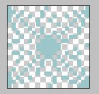
The objective of this tutorial is to create the image as shown below.

This tutorial will explain how to use custom shape as a pattern and save the new pattern in Photoshop.
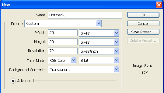
  1. Create a new file with size 20 x 20 pixel and make it transparent.
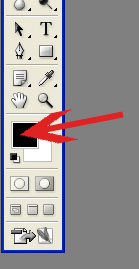
  2. Next, choose your forecolours. Check the picture below. Double click the black box.
    [Note that the black box represent your foreground colour and the white box represent the background colour. It may not be the same colour depending on the previous colours you used in the past]
  3. A new dialog box will appear and ask you to choose the colour. Make sure you do not click the box 'Only Web Colors' and put in 9dc6ca as your foreground colour.
    [For the purpose of this tutorial, the pattern that will be created is based on this blog. Thus the colour chosen will be the same as mine :)]
    With the same technique, choose your background colour by clicking the white box instead of the black box. Put c5d1d0 as your background colour.
  4. Next, you need to choose custom shape tool.
    [Custom shape tool give you the ability to choose various shapes that are available in the photoshop]
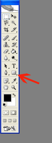
    Check the red arrow on the picture below. The picture shows the location of custom shape tool but at the moment it is hidden.
    [In the Tools, there are more options shown but most of them are hidden. Can you see the small black triangle at the bottom right of the square? The small black triangle indicate there are hidden tools. If you check the rest of the tools, there are a lot of those small black triangle. Give it a try to check what kind of tools are available :)]
    The square shown in the picture represent the rectangular tool. Right click at the square....
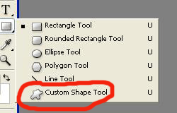
  5. And, a dialog box will appear. Click custom shape tool as shown below.
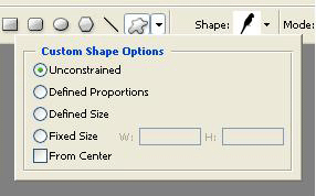
  6. Next, a new option will appear at the top of the window. Click as shown in the red box.
    [Everytime you click any tools, there will appear a new option on the top of the window. It is not exactly top though, the option will appear below standard toolbar {File Edit Image Layer etc}]
  7. Next, click the small black down arrow as shown in right red box. Choose unconstrained.
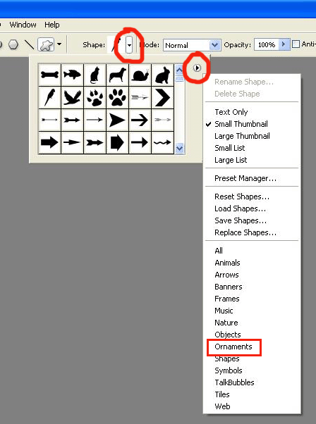
  8. Next, we need to choose the custom shape that we would like to use. First, click the black down arrow next to the black bird (The image may be differ from yours depending on the last shape you used). A new box will appear. Click the down arrow as shown in the picture below. Then, choose Ornaments.
    [This step shows how you can replace and choose any custom shape available in Photoshop. There are few categories available]
    A dialog box will appear and ask you whether you want to replace the current shape with ornament.csh.
    [If you click ok, the Ornament shape will replace the current shape and by clicking append, it will add ornament shape to the current one.]
    Click OK.
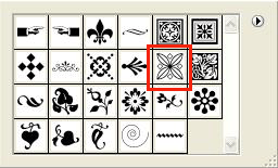
  9. Next, choose this shape :)
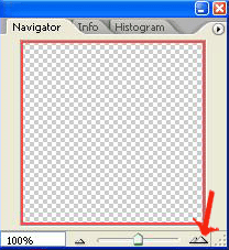
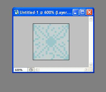
  10. Since the file is only 20 x 20 pixel, we need to zoom in before applying the ornament shape. So, find the navigator tools on your top left and click as shown by the red arrow. Click it until you reach 600%.
    [The navigator tool is an important tool. If you zoom out and want to move to another part of the image, the easiest way is to drag the red box in the navigator tool]
  11. After zoom in the image, apply the shape. Drag your mouse from top-left corner of the image to the bottom right corner. Make sure the ornament fit the whole box. The image should look like this...
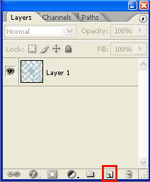
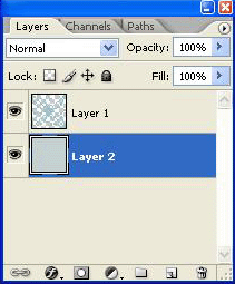
  12. Next, we need to create a new layer. Go to the layer tool on bottom right corner and click the symbol as shown in the red box.
    [The symbol is a shortcut to create a new layer. Tips: if you drag layer 1 to that symbol, a duplicate layer will be created. If you drag any layer to the dustbin ie the symbol on the right, the layer will be deleted]
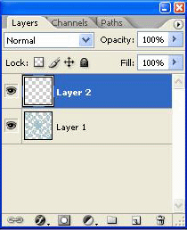
  13. A new layer will be created. Layer 2.
  14. Next, we need to change the foreground colour to the background colour. Go the foreground tool and click the arrow as shown in the picture. This will change your background colour into foreground. The foreground colour now should be lighter than the background.
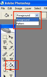
  15. Make sure you have clicked layer 2. Now, choose fill tool and choose fill foreground as shown in the picture.
  16. The mouse now should change into a paint bucket. Click the mouse on the empty area of the image and the foreground colour should fill the entire image.
  17. If everything is right, the workspace should look like this.
  18. Now, we need to move layer 2. Drag layer 2 below layer 1 and now it should look like this.
  19. The image should be looking something like this now...
The final step is to save this image as a new pattern. Click Edit / Define pattern / and put whatever name you like.

Next tutorial will explain on how to apply this pattern such that it can be put into as background of the blog :)


Friday, August 18, 2006

blogger in beta

Blogger has recently upgrade the features on blogger.com

There are few changes in the way we set up the blog. There is an option that can restrict your blog audience to few people only. I think the main notable difference is the additional option to edit the template. Previously, Blogger only offer one big empty space for the user to put any html/css/javascript. Well, that interface may suit some people who knows the technical jargon of html but not for the beginners. Hence the new interface provides a good interface for the beginners and it is quite user friendly.

This new interface is still in beta and at the moment, you can only join the beta version by signing up using Gmail account or wait for the invitation from the blogger (need to check the dashboard for that)

Tour

Thursday, July 06, 2006

Blue

New look :) [with graphical smilies added]

There are few minor things to be added. Give me comments for me to improve on. This template look best in Firefox 1.5 but in Internet Explorer, the body shift to the right. Don't know how that happened.